Context
CircumVent
The CircumVent Project came to life during the COVID-19 pandemic to address the urgent need for affordable respiratory care solutions.
Over just two months, I had the chance to:
design the brand logo
create a cohesive identity
develop an intuitive website layout
produce comprehensive training modules
It was a meaningful project that allowed me to use my skills to support an important cause, and I’m grateful to have been part of it.
Logo Design
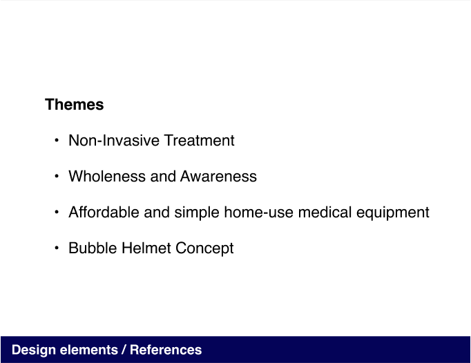
Themes and Inspiration for Logo Design
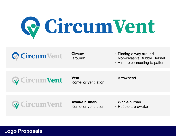
The logo design draws inspiration from key themes that reflect the project’s mission and values. These themes emphasize patient-centered care, accessibility, and innovation, creating a visual identity that is both meaningful and approachable.
Non-Invasive Treatment:
Capturing the innovative and patient-friendly approach to COVID-19 care, focusing on non-invasive solutions.
Wholeness and Awareness:
Highlighting holistic care that keeps individuals awake and engaged, fostering a sense of empowerment and trust.
Accessibility and Simplicity:
Showcasing the affordability and ease of use of the equipment, making it practical for home settings.
Bubble Helmet Concept:
Inspired by the unique design of the bubble helmet, representing safety, adaptability, and forward-thinking.
Each theme guided the design, resulting in a logo that feels approachable, innovative, and thoughtful.
Module Presentation
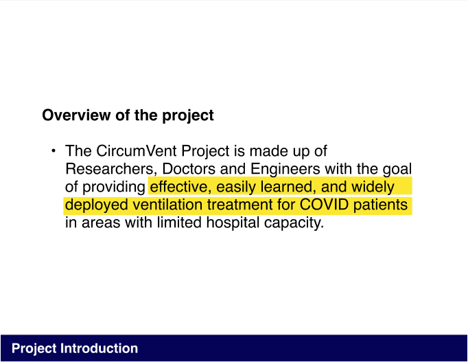
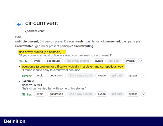
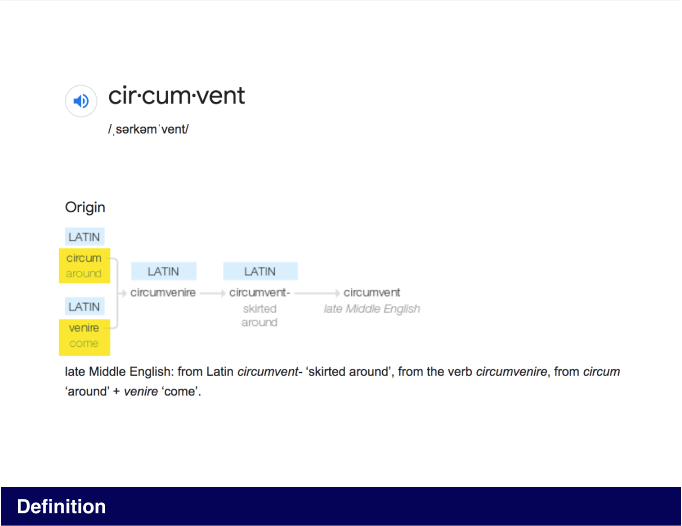
For the module presentation, our goal was to ensure the information was presented as simply and straightforwardly as possible.
While I was not involved in creating the content or writing, I focused on designing and structuring the presentation pages to be concise, clear, and visually cohesive.
Cover Pages:
Incorporate two font styles to reflect the logo’s typeface, creating a strong visual connection to the brand identity.
Content Pages:
Use a single, consistent typeface throughout for clarity and simplicity.
Website Design
For the website design, the focus was on creating a simple and user-friendly wireframe and structure. The illustrations and photos for the mockups were provided by the client kindly, and I worked to ensure the layout complemented these elements while remaining clean and intuitive.
Key design details include:
Wireframe and Structure:
Designed to be straightforward, making navigation as seamless as possible.
Typography:
The largest titles on each page use a serif font for a touch of distinction.
All other text, including descriptions, is in a sans-serif font to keep things easy to read.
Visual Integration:
Worked to seamlessly incorporate the client’s illustrations and photos into the design.
Simplicity and Clarity:
Kept the layout clean and uncluttered to allow the content and visuals to stand out.
This project was an opportunity to support a clear and cohesive website design that highlights the client’s vision.


